 know what I want when I see it")
When you see a design, you instantly know whether you like it or not; the challenge is figuring out which components you love and which you don’t. And, while understanding your likes and dislikes is a personal journey that everyone must undertake, how can you apply that lesson to providing input on a design project, or any project?
Will the designer get it right in the first go?
No Chance.
Should he get right it in one go?
No! If he does you don’t know what you want or you met God.
A design project is, at its core, a collaborative effort. Working on a project together may be a fantastic way to understand basic design fundamentals, as well as what you want your brand to represent and how you want your audience to perceive it.
Kickoff your project with a brainstorming session to bounce ideas around, ideally, you’ll want to define the scope of your project right away. While this may appear to be a daunting task, it may be beneficial, and your designer will appreciate some insight into your mindset and brand vision.
It’s time.
The worst decision would be to jump on a call with the designer as soon as you get the design, without knowing what you hate and love about it. The more you understand what you dislike about a design the easier it will be for the designer to change, so let’s take an example and break down some important elements to help you give constructive feedback.
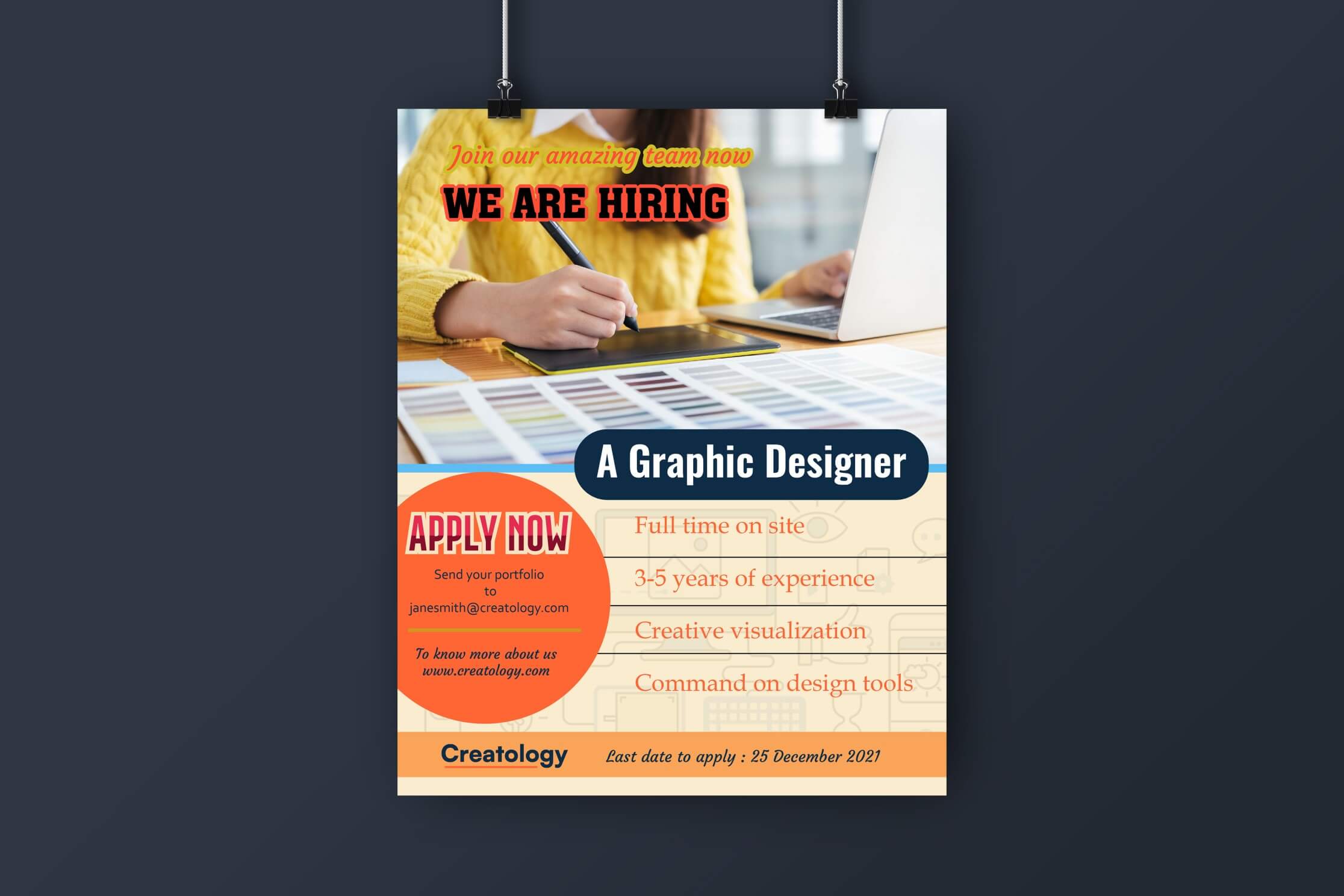
This is a simple hiring post that will go on an Agency’s social media channel. As an exercise note the first 5 things about the post that you dislike before you read any further.
I hope you didn’t cheat but oh well..
“I don’t have the content yet, can you make a draft first?”
Ummm, red flag 🚩🚩🚩🚩
We understand that writing a copy for the creative can be difficult to visualize but a simple exercise can give you a copy that captures the feel and is closest to the final design.
Break it down into “AMA”–
Audience – who is the target audience this creative intended is intended for?
Message- what is the message you want to communicate to your audience?
Action- what is the action you want your audience to take? It can be visiting your website, or in our case apply for this role, etc.
With this framework, you can develop the most effective copy.
That locks down the content so let’s move on to design feedback.
“Can you make it modern and clean, but warm and home-y at the same time. I don’t want it to be too busy or make us look boring!”
Vague feedback is the biggest enemy and will waste more time than you think. This is a recipe for disaster and will give you 100+ visuals which you will ultimately discard because you’re confused about the purpose of your design.
So let’s use this poorly designed sample and get into simpler elements and principles that make a functional design and allow you to give meaningful feedback.
-
- Visual Hierarchy, flow, and scale

Visual hierarchy is how we as humans process text and design; it can assume the shape of an “F” or a “Z”. The visual hierarchy is usually based on the “visual flow,” the order in which the viewer looks at images and graphics. A well-designed flow allows the visual hierarchy to draw attention to all elements in a linear sequence with the end being the action you want to take, in this case, apply for the role.

It is important to consider scale and proportion when determining the hero of a given work, in our case is the copy. The scale of the text in proportion to the image or illustration can be larger if you’re able to communicate the purpose efficiently.
Elements can overwhelm a design, and supplementary information that is too small can harm utility.
Balance and moderation are essential in any design composition.
“Can you make the font bigger and funkier?”
- Typography & Alignment
After deciding the content and visual flow let’s move on to Typography. The first objective of typography in graphic design is clarity, and the second is to aid in the delivery of a design piece’s sentiment. The terms “font” and “typeface” are frequently swapped. A collection of fonts is known as a typeface.
A font is a typeface variant that is usually bold, italic or a combination of both. Consider typefaces to be characteristics, and match your typeface to your target audience.

Fonts are also usually stated in your Brand Style Guidelines, when pairing your primary and secondary fonts resist matching two fonts or typefaces with minor differences, there should be a clear distinction between the two.
The positioning of visual elements in a design so that they sync is known as alignment. We use alignment to organize, group, and establish balance and structure in our designs. Depending on where you position the elements on your design, there are various distinct sorts of alignment such as left, right, vertical, and center.
“Can you use a different colour to make it pop?”
-
- Colour and contrast
Colour and contrast can be used in a variety of ways to lead the audience’s focus in a design. It appeals to us, especially when it’s employed to emphasize vital information or visuals.
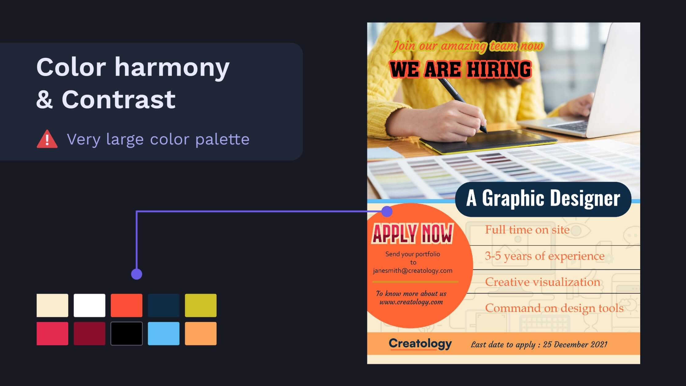
For consistent and clear communication, it’s better to stick to the colour palette defined in your Brand Style Guidelines. If you don’t have one, it’s definitely worth investing to make one. Be sure to not restrict your colour palette to black and white, allow some other colours for some creativity.
If you already have a colour palette knowing commonly used terminology will give precise feedback. Tint, tone, and shade are all relevant to colour variations, with the hue acting as the base colour. Colour temperature pairings, especially those with great contrast, can draw a lot of attention.
Too many colours or poor choice of colour that distracts from the intended purpose ( apply for the role), can lead to poor output.
“Can’t wait to work together on a project again!”
This is the final functional design you should end up with after giving your designer useful feedback that checks all the elements of a functional and appropriate design.

Some might have noticed the terms “appropriate” and “functional” interspersed frequently; every design should respond to these two critical questions.
Is it suitable for the intended audience and industry?
Is the design fulfilling the goal for which it was created?
In our instance, we’re seeking experienced designers.
Rather than instructing a designer to execute exactly what you want, creative collaboration entails communicating your ideas.
Equip yourself with these pointers the next time you start a project. Give great design feedback, and you’ll be well on your way to a terrific design and harmonious and lasting working relationship with your designer.
Save and share this Design Feedback Checklist with your network if you are a designer or work with designers.
If you’re a designer that fits this description and looking for a challenging role then reach out to us on malhar@heltrskeltr.in
